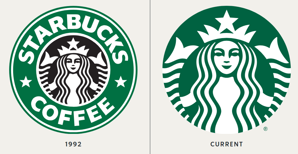
The Hidden Detail In The Starbucks Logo That Most People Don’t Know About
Starbucks’ iconic siren logo has a hidden secret: subtle asymmetry. While the siren’s face appears symmetrical, a closer look reveals a slight shadow on the right side, with a dip in her nose and a partially hidden eye.
This imperfection was intentionally added to make the logo feel more human and relatable. So, next time you sip your coffee, give the siren a second glance—she’s more than meets the eye!